
The following CSS classes are used by all page styles.
Horizontal Multi-Level Menu Styles
Vertical Multi-Level Menu Styles
Classic Horizontal Classic Menu Styles
Button / Pagination Bar Styles
.pcT { /* page container top center edge (header container) */ }
.pcL { /* page container left middle edge (vertical menu container) */ }
.pcC { /* page container center (contents of page container) */ }
.pcB { /* page container bottom center edge (footer container) */ }
.bTL { /* theme button top left edge */ }
.bT { /* theme button top center edge */ }
.bTR { /* theme button top right edge */ }
.bL { /* theme button left middle edge */ }
.bC { /* theme button center */ }
.bR { /* theme button right middle edge */ }
.bBL { /* theme button bottom left edge */ }
.bB { /* theme button bottom center edge */ }
.bBR { /* theme button bottom right edge */ }
a.button_link { /* link text of free-standing button */ }
a.button_link:hover { /* link text of free-standing button hover state */ }
.thc a.button_link { /* link text of button in column header cell */ }
.thc a.button_link:hover { /* link text of button in column header cell hover state */ }
.tic a.button_link { /* link text of button in data grid row button cell */ }
.tic a.button_link:hover { /* link text of button in data grid row button cell hover state */ }
.ttc a.button_link { /* link text of button in data grid data cell */ }
.ttc a.button_link:hover { /* link text of button in data grid data cell hover state */ }
.prbg a.button_link { /* link text of button within pagination row */ }
.prbg a.button_link:hover { /* link text of button within pagination row hover state */ }
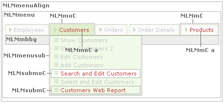
.MLMmenuAlign { /* horizontal menu container alignment */ }
.MLMmenu { /* horizontal menu container */ }
.MLMmenusub { /* horizontal submenu container (menu leaves) */ }
.MLMmC { /* horizontal menu item link text */ }
.MLMmoC:hover, .MLMmoC:hover a, .MLMmoC { /* horizontal menu item link text hover state */ }
.MLMsubmC { /* horizontal submenu item link text */ }
.MLMsubmoC { /* horizontal submenu item link text hover state */ }
.MLMmbbg { /* horizontal menu bottom trim */ }
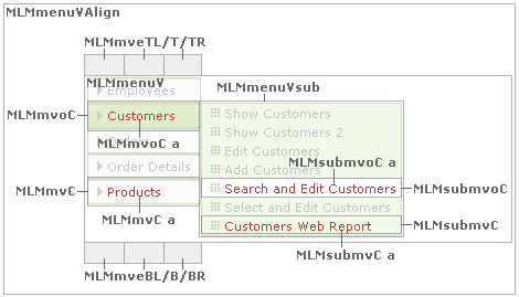
.MLMmenuVAlign { /* vertical menu container alignment */ }
.MLMmenuV { /* vertical menu container */ }
.MLMmenuVsub { /* vertical submenu container (menu leaves) */ }
.MLMmvC { /* vertical menu item link text */ }
.MLMmvC:hover, .MLMmvC:hover a, .MLMmvoC { /* vertical menu item link text hover state */ }
.MLMsubmvC { /* vertical submenu item link text */ }
.MLMsubmvoC { /* vertical submenu item link text hover state */ }
.MLMmveTL { /* vertical menu top left edge */ }
.MLMmveT { /* vertical menu top center edge */ }
.MLMmveTR { /* vertical menu top right edge */ }
.MLMmveBL { /* vertical menu bottom left edge */ }
.MLMmveB { /* vertical menu bottom center edge */ }
.MLMmveBR { /* vertical menu bottom right edge */ }
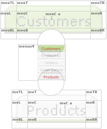
.menus { /* horizontal menu container */ }
.menu { /* horizontal/vertical menu item text */ }
a.menu { /* horizontal/vertical menu item link text */ }
a.menu:hover { /* horizontal/vertical menu item link text hover state */ }
.moTL { /* horizontal menu highlighted item top right edge */ }
.moT { /* horizontal menu highlighted item top center edge */ }
.moTR { /* horizontal menu highlighted item top right edge */ }
.moL { /* horizontal menu highlighted item left middle edge */ }
.moC { /* horizontal menu highlighted item center */ }
.moR { /* horizontal menu highlighted item right middle edge */ }
.moBL { /* horizontal menu highlighted item bottom left edge */ }
.moB { /* horizontal menu highlighted item bottom center edge */ }
.moBR { /* horizontal menu highlighted item bottom right edge */ }
.moC a { /* horizontal menu highlighted item link text */ }
.mTL { /* horizontal menu item top right edge */ }
.mT { /* horizontal menu item top center edge */ }
.mTR { /* horizontal menu item top right edge */ }
.mL { /* horizontal menu item left middle edge */ }
.mC { /* horizontal menu item center */ }
.mR { /* horizontal menu item right middle edge */ }
.mBL { /* horizontal menu item bottom left edge */ }
.mB { /* horizontal menu item bottom center edge */ }
.mBR { /* horizotnal menu item bottom right edge */ }
.mel { /* horizontal menu container left edge */ }
.mer { /* horizontal menu container right edge */ }
.mbbg { /* horizontal menu bottom trim */ }

.menusV { /* vertical menu container */
.menu { /* horizontal/vertical menu item text */ }
a.menu { /* horizontal/vertical menu item link text */ }
a.menu:hover { /* horizontal/vertical menu item link text hover state */ }
.mvoTL { /* vertical menu highlighted item top right edge */ }
.mvoT { /* vertical menu highlighted item top center edge */ }
.mvoTR { /* vertical menu highlighted item top right edge */ }
.mvoL { /* vertical menu highlighted item left middle edge */ }
.mvoC { /* vertical menu highlighted item center */ }
.mvoR { /* vertical menu highlighted item right middle edge */ }
.mvoBL { /* vertical menu highlighted item bottom left edge */ }
.mvoB { /* vertical menu highlighted item bottom center edge */ }
.mvoBR { /* vertical menu highlighted item bottom right edge */ }
.mvoC a { /* vertical menu highlighted item link text */ }
.mvoC a:hover { /* vertical menu highlighted item link text hover state */ }
.mvTL { /* vertical menu item top left edge */ }
.mvT { /* vertical menu item top center edge */ }
.mvTR { /* vertical menu item top right edge */ }
.mvL { /* vertical menu item left middle edge */ }
.mvC { /* vertical menu item center */ }
.mvR { /* vertical menu item right middle edge */ }
.mvBL { /* vertical menu item bottom left edge */ }
.mvB { /* vertical menu item bottom center edge */ }
.mvBR { /* vertical menu item bottom right edge */ }
.mvC a { /* vertical menu item link text */ }
.mvC a:hover { /* vertical menu item link text hover state */ }
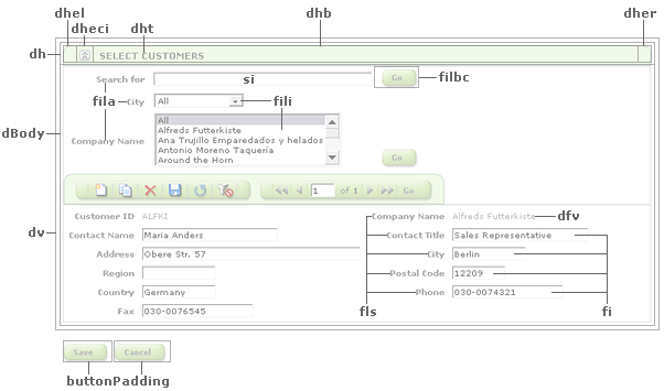
.dBody { /* panel content container (excludes panel header) */ }
.dBody2 { /* alternate panel content container (excludes panel header) */ }
.dBodyShowSelectRecordDivider { /* deprecated */ }
.dfv { /* panel field value text */ }
.dh { /* panel header container */ }
.dhb { /* panel header */ }
.dht { /* panel header title text */ }
.dhtr { /* deprecated: record panel header title text */ }
.dhel { /* panel header left edge */ }
.dher { /* panel header right edge */ }
.dhi { /* panel header add/edit/show icon container */ }
.dhir { /* record panel header add/edit/show icon container */ }
.dheci { /* panel header expand/collapse icon container */ }
.dhpei { /* panel header print/email icon container */ }
.dhtrc { /* panel header total record count container */ }
.dhtrct { /* panel header total record count text */ }
.dv { /* panel container (includes panel header) */ }
.dv2 { /* nested panel container (includes panel header) */ }
.c { /* category filter container */ }
.ca { /* category filter */ }
.ca A { /* category filter link text */ }
.ca A:hover { /* category filter link text hover state */ }
.scl { /* category filter label */ }
.sc SELECT { /* category filter drop-down list */ }
.rpbAlign { /* page buttons alignment */ }
.buttonPadding { /* page buttons padding */ }
.fl { /* field label (on top) */ }
.fls { /* field lable on side */ }
.fv { /* field value */ }
.fi { /* input textbox */ }
.filv { /* filter value */ }
.filbc { /* filter button container */ }
.fili { /* filter drop-down list */ }
.fila { /* filter label */ }
.sa { /* search area container */ }
.sl { /* search label */ }
.si { /* search textbox */ }
.rft { /* range filter label */ }
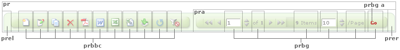
.prbbc { /* button bar button container */ }
.prbg { /* pagination row button container */ }
.pra { /* pagination row container */ }
.pr { /* button bar/pagination row container */ }
.prel { /* button bar/pagination row left edge */ }
.prer { /* button bar/pagination row right edge */ }
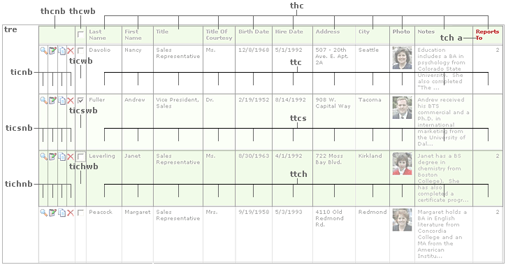
.thc { /* column header container */ }
.thcnb { /* column header container (above row buttons) */ }
.thcwb { /* column header container (above select checkbox) */ }
.thce { /* column header container (when no column header text is present) */ }
.tch { /* column header text */ }
.tch A, .tchs A { /* column header link text */ }
.tch A:hover, .tchs A:hover { /* column header link text hover state */ }
.tchs { /* column header (in scrolling table) link text */ }
.tchfilp { /* above column filter container */ }
.tchfilp A { /* above column filter link text */ }
.tchfilp A:hover { /* above column filter link text hover state */ }
.tic, .taic { /* deprecated: data grid row button container */ }
.tich, .taich { /* deprecated: data grid row button container highlighted state */ }
.tics { /* deprecated: data grid row button container selected state */ }
.ticnb { /* data grid row button container */ }
.tichnb { /* data grid row button container highlighted state */ }
.ticsnb { /* data grid row button container selected state */ }
.ticwb { /* data grid select checkbox container */ }
.tichwb { /* data grid select checkbox container highlighted state */ }
.ticswb { /* data grid select checkbox container selected state */ }
.tichb { /* data grid right-most row button container (when no select checkbox is present) */ }
.tichhb { /* data grid right-most row button container (when no select checkbox is present) highlighted state */ }
.ticshb { /* data grid right-most row button container (when no select checkbox is present) selected state */ }
.tice { /* data grid row button container (when no row button is present) */ }
.tiche { /* data grid row button container (when no row button is present) highlighted state */ }
.ticse { /* data grid row button container (when no row button is present) selected state */ }
.ttc, .tatc { /* data grid data container */ }
.ttch, .tatch { /* data grid data container highlighted state */ }
.ttcs { /* data grid data container selected state */ }
.ttc a, .tatc a, .ttch a, .tatch a, .ttcs a, .dfv a, .dialog_field_value a { /* data grid data link text */ }
.ttc a:hover, .tatc a:hover, .ttch a:hover, .tatch a:hover, .ttcs a:hover, .dfv a:hover, .dialog_field_value a:hover { /* data grid data link text hover state */ }
.ttc .dv, .ttch .dv, .ttcs .dv { /* panel container nested within data grid */ }
.ttc .ajax__tab_xp, .ttch .ajax__tab_xp, .ttcs .ajax__tab_xp { /* tab container nested within data grid */ }
.tpttc { /* data grid totals container */ }
.tpttcv { /* data grid totals text */ }
.tptl { /* data grid page totals label */ }.tptv { /* data grid page totals text */ }
.tgtl { /* data grid grand total label */ }
.tgtv { /* data grid grand total text */ }
.tre { /* data grid container */ }
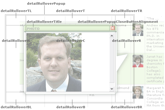
.detailRolloverPopup { /* detail rollover popup container */ }
.detailRolloverTitle { /* detail rollover popup title */ }
.detailRolloverPopupCloseButtonAlignment { /* detail rollover popup close button container */ }
.detailRolloverTL { /* detail rollover popup top left edge */ }
.detailRolloverT { /* detail rollover popup top center edge */ }
.detailRolloverTR { /* detail rollover popup top right edge */ }
.detailRolloverL { /* detail rollover popup left middle edge */ }
.detailRolloverC { /* detail rollover popup center */ }
.detailRolloverR { /* detail rollover popup right middle edge */ }
.detailRolloverBL { /* detail rollover popup bottom left edge */ }
.detailRolloverB { /* detail rollover popup bottom center edge */ }
.detailRolloverBR { /* detail rollover popup bottom right edge */ }
By default, the pagination control is right-justified.
To set the control to be left-justified, the following needs to be updated on a per-panel basis:
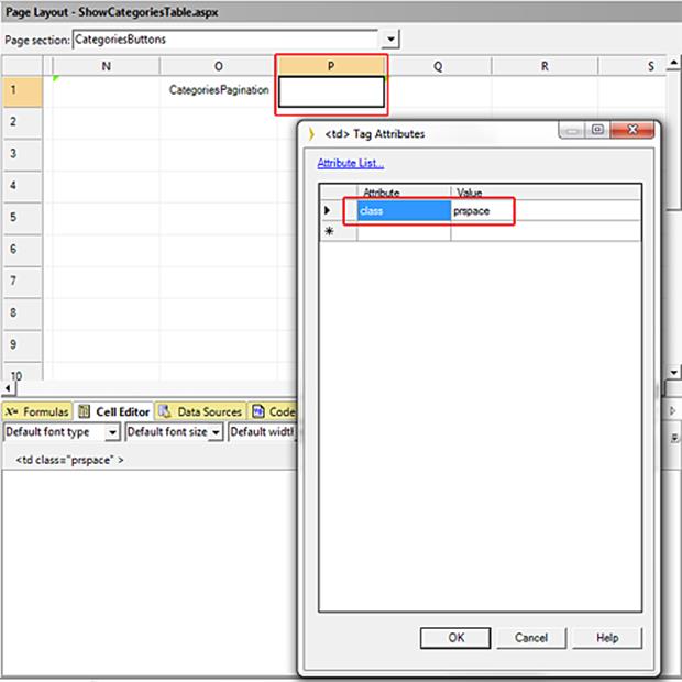
(1) Change the class of the cell containing the “ButtonBarEdgeR.gif” image from “prspace” to “prbbc” (see the following image).
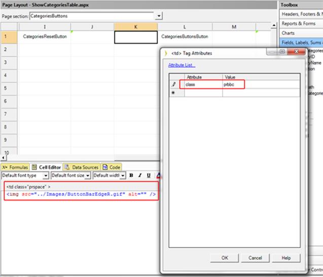
(2) Insert a new column to the right of the cell containing the pagination control; set its class to “prspace” (see the following image”).
(3) If in “BaseStyles.css”, the class “pra” has a “width: 100%” attribute, comment it out.